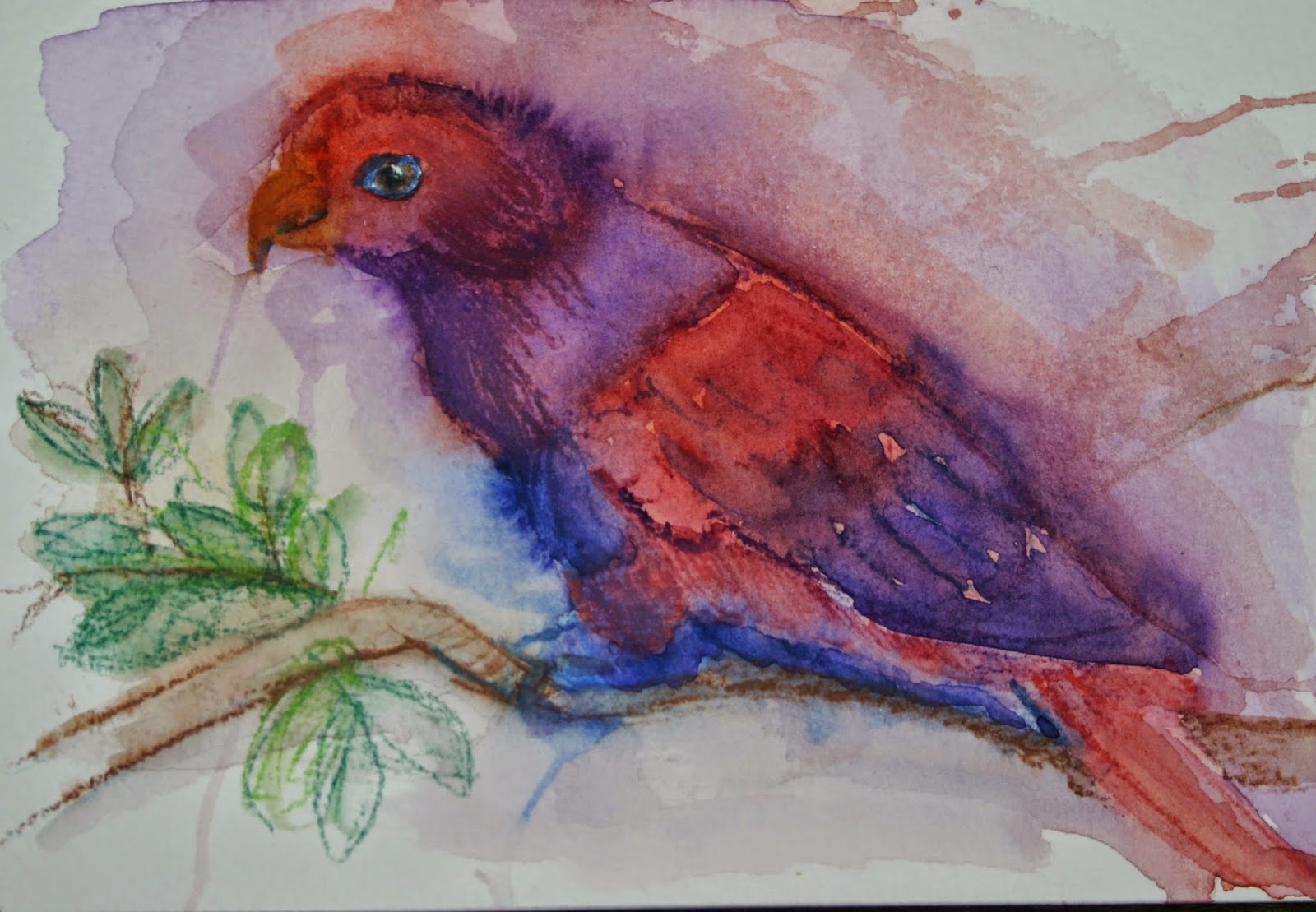
I feel honoured, yet somewhat intimidated to be part of this group of artists. Having spent the past couple of weeks claiming squatters rights in Vandy Massey's studio, I have had the opportunity to see the research she puts into the paints and papers she uses. Because I am an illustrator and graphic designer, my research goes into my subject matter and idea generation. What does it look like? How is it structured? How does it behave? How can I represent it on page? What paint to use is usually a matter of which ones I prefer using and know will give me a result. The problem is, I have a bunch of colours I don't use very much and I should know what they do.
Vandy also runs the "Running with brushes" charity initiative and wanted to reach a total of 400 paintings before the new year, so each wash, in my opinion, needed to be an exercise that ended in a painting. My best sellers so far have either been cats or birds. Birds seemed the best subject matter to work with in terms of vibrancy and variety of colour, so birds it is (for now).
Number one wash, is a combination of Windsor and Newton, Cadium Red light, Cobalt Blue and Ultramarine Violet. The Paper is Bockingford NOT 300gsm (and will be for the next couple of months). The bird: a Violet-necked Lory (appropriate because I was named after the bird). The underlying sketch was done in Derwent watercolour pencil. What I didn't appreciate before I started this was the staining quality of Cadmium Red and the fact that it is opaque. The end result is overworked because I tried to wash some of the red back and ended up having to work over the red, which resulted in a pretty muddy picture. So not an auspicious start to this year of washing. However, it can only get better from here...


